


How might we…
Modernize Honolulu yet embrace the traditional Hawaiian culture?
Adobe Photoshop | Adobe Illustrator | ProCreate
Logo
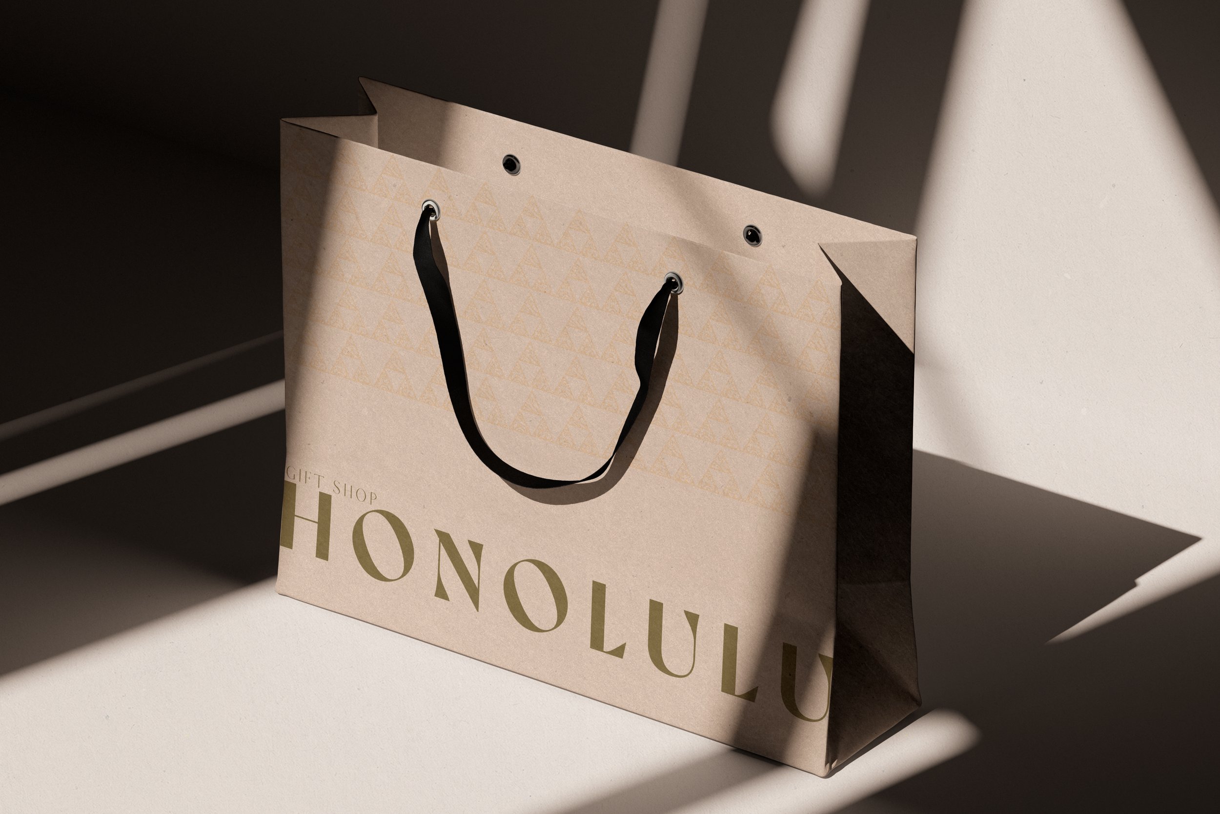
The final design of the logo is based on the unity Polynesian symbol, which is made up of three triangles placed in a pyramid formation. The strong contrast between light and dark creates a balance in life. Each triangle represents a different aspect of Hawaiian culture. None of each element could thrive on its own. Together, these triangles bring accord and harmony.

Logo Components.
Although none of the triangles could thrive without the others, they could be taken apart for different occasions or the sake of simplicity.
-
The top triangle is replaced with a tiki figure -- half-man, half-god, and a mythical creature that created human beings. It's a figure that Polynesians used to worship and fear. Tiki represents power, knowledge, wisdom, prosperity, and many vital concepts.
-
The bottom left triangle represents the world of people, replaced with two symbols of people facing each other, symbolizing unity and stronger together. In the context of this logo, the two people represent the two worlds colliding (tourists and local Hawaiian people).
-
The bottom left triangle represents nature. This triangle contains two symbols; the top symbolizes a seashell, and the bottom symbolizes a hammerhead shark. Seashell is equivalent to affluence and abundance. While the hammerhead shark is a representation of determination and is fearless.

-
![]()
Logo pattern
colored
-
![Pattern of interlocking triangles in dark brown and light brown.]()
Logo pattern
simplified
-
![]()
Logo pattern
black and white


Logo displayed with the Honolulu text.
The logo could be simplified to just the unity symbol in a more corporate setting or if needed at a smaller scale.
Color Scheme.
The color scheme of the rebranding is neutral and earthy. It has moved away from the overdone, outdated rainbow color scheme. Honolulu is a picturesque paradise. Additional colors and landscapes shouldn't steal the stage of the natural landscape.


Typography.
Let’s Work Together!
Whether you have a specific final direction or an ambiguous crazy idea, let's work together and get to your final vision. Please reach out! I can’t wait to work with you!